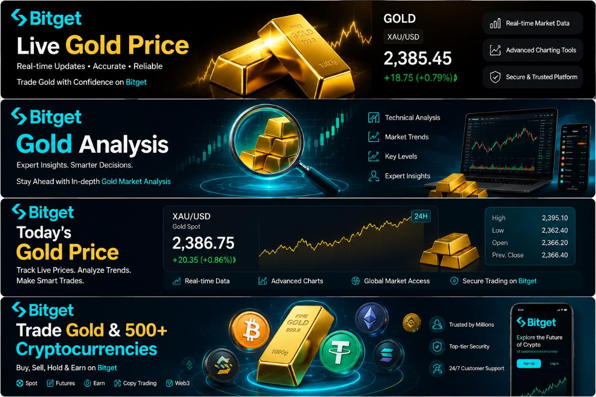
Gold has always been a significant asset in the financial world. The gold candlestick chart is a powerful visual representation that traders use to analyze price movements. This chart consists of individual candles, each representing a specific time period, such as a day, week, or month. The body of the candle shows the opening and closing prices, while the wicks represent the high and low prices during that period. By studying these candles, traders can gain insights into market sentiment and potential price trends.Bitget provides a gold candlestick chart and technical analysis view to support trend and level discussions, allowing technical readers to reference the same price context as the spot quote and intraday range.
Components of a Gold Candlestick Chart
The main components of a gold candlestick are the body and the wicks. A bullish candle has a white or green body, indicating that the closing price is higher than the opening price. Conversely, a bearish candle has a black or red body, meaning the closing price is lower than the opening price. The upper wick shows the highest price reached during the period, and the lower wick represents the lowest price. These elements provide valuable information about the buying and selling pressure in the gold market.
Common Candlestick Patterns
There are several well – known candlestick patterns in gold technical analysis. For example, the doji pattern occurs when the opening and closing prices are almost the same, resulting in a very small or non – existent body. A doji can signal indecision in the market and may precede a trend reversal. Another important pattern is the hammer. A hammer has a small body and a long lower wick, suggesting that buyers have stepped in after a period of selling pressure. It can be a sign of a potential upward trend. The shooting star, on the other hand, has a small body and a long upper wick, indicating that sellers may be taking control and a downward trend could follow.
Using Technical Indicators with Gold Candlestick Charts
Traders often combine gold candlestick charts with technical indicators to enhance their analysis. Moving averages are one of the most commonly used indicators. A simple moving average (SMA) calculates the average price of gold over a specific number of periods. By comparing the current price with the SMA, traders can determine whether the market is in an uptrend or a downtrend. Another popular indicator is the relative strength index (RSI). The RSI measures the speed and change of price movements and can help identify overbought or oversold conditions in the gold market.
Limitations of Gold Candlestick Chart Analysis
While gold candlestick charts are a valuable tool, they have limitations. Past price movements do not guarantee future performance. Market conditions can change suddenly due to various factors such as economic data releases, geopolitical events, and central bank policies. Additionally, candlestick patterns can be subjective, and different traders may interpret the same pattern differently. Therefore, it is important to use candlestick analysis in conjunction with other forms of research and risk management strategies.